Reclaim Foundation’s Brand Identity
There is meaning behind everything at Reclaim Foundation! Our logo was created with symbolic elements and our colors were carefully chosen to elicit feelings of hope and tranquility. We want our brand identity to accurately reflect our commitment to the trauma community in a thoughtful manner. We also take steps to ensure our website content is accessible to those with certain visual impairments and/or hearing loss.
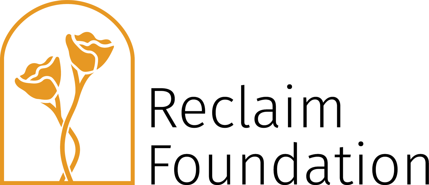
Logo Design

Reclaim Foundation originates from California, so the vibrant golden poppies depicted in our logo pay homage to California’s state flower. Poppies have many symbolic adaptations but we particularly admire their association with recovery and relief of pain. The poppy often closes its petals for harsh weather but reopens in brighter conditions. Even through harsh circumstances, poppies remind us there are always reasons to open back up and lean toward the sunlight again. Our logo includes a twist at the flower stems since a twist is often seen as the symbol of post-traumatic stress disorder. The twist configuration also signifies that the path of trauma treatment is not always linear, but you will continue to grow along the way. The poppies are observed through a window, allowing the viewer to admire them. Reclaim Foundation supports survivors transitioning from watching life behind a window to participating fully and thriving outside in their own way. A backdrop of deep navy blue allows the poppies to stand out. Much like the colors of our logo, we do not want to shy away from the darker shades of life and know we can still grow in their presence.
Color Palette

Our color palette is inspired by hope, resilience, and tranquility. The primary palette centers on a bold, eye-catching shade of orange.
The secondary colors are muted calming tones, which add light and modernity to enhance the boldness of the primary colors. Reclaim Foundation pulls from both of these color palettes for branded collateral and marketing materials.
Color Accessibility


When developing our color palettes we considered Color Universal Design (CUD) so that people with various forms of color vision impairment and/or color blindness would still be able to distinguish between the color hues in our design elements. We utilized CUD for our logo and brand identity to be inclusive and visually accessible for people with common forms of vision impairment, such as deuteranopia and protanopia.
Our website also has alternative text for all visual content so that users with certain visual impairments can receive accurate descriptions of our photos and graphics by using an audio text reader, or other similar devices. Additionally, all of our original video content includes captioning in consideration of those with hearing loss.
If you have trouble accessing content on our website, please contact us and we would be happy to discuss adding additional accessibility measures.